We’ve talked at length about the importance of developing a content strategy built to attract serious franchise buyers combing the web for an opportunity that speaks to them.
The second logical step in the inbound methodology is converting those interested visitors into leads you can nurture through the franchise sales process and eventually close—the final step of the inbound process.
This post will focus squarely on how to create a compelling call to action that will earn the clicks of your website visitors, leading them on the start of their conversion path.
What are calls-to-action (CTAs) and why are they important for lead generation?
Calls-to-action (CTAs) are buttons or links that encourage prospects to take action.
Whether it’s downloading a white paper or any other kind of downloadable material or contact form, just about every next step on your franchise website is prompted by strategically placed CTAs.
Here's a simple example:
 Source: Ace Hardware
Without these prompts to take action, the visitor is forced to actively search for answers by combing the site themselves.
This chore frustrates many to the point where they leave your site and move on to explore other opportunities.
Types of franchise CTAs (with examples)
As for how they appear on your website, CTAs can take just about any form or shape depending on the kind of page and content displayed.
That said, here are some common styles of CTAs you've probably encountered:
In-text (anchor text) CTA
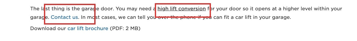
Source: Garage Living
This is the easiest, plainest CTA you'll find, but can be very effective. It consists of some anchor text with an embedded link.
You'll often see these in site content like blog posts, and they can really help your conversion rate.
Styled text CTA

Source: Endurmo
These are one step up from the humble in-text CTA, with links embedded in specially styled text to make them stand out a little more.
Plain button CTA
Source: cmit solutions
This style consists of a styled button, some text, and an embedded link.
Image CTA

Source: Junk King
This is a more elaborate CTA. It typically includes text, some kind of designed element, and sometimes a button. The link may be embedded in the entire image.
Pop-up CTA
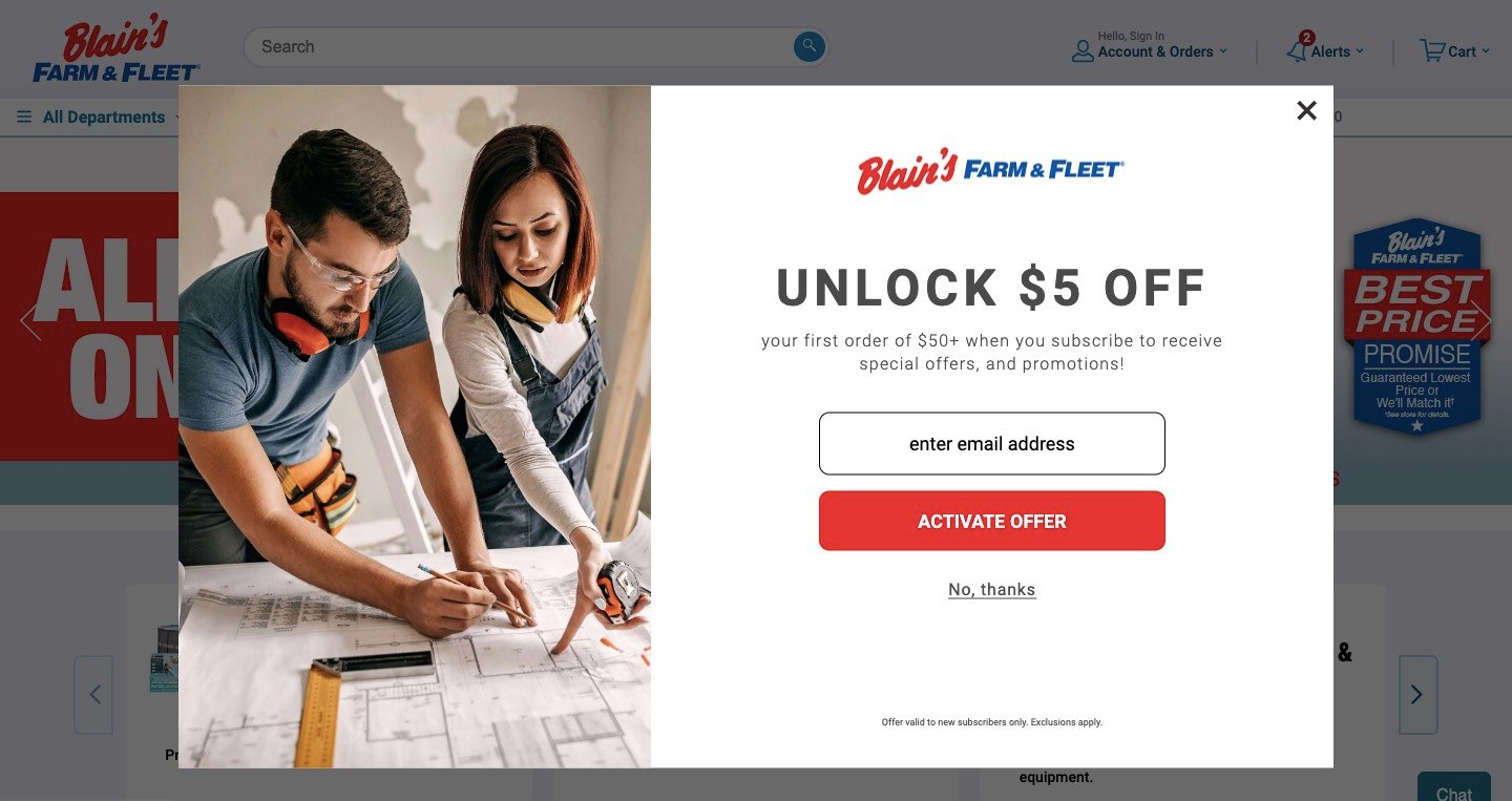
Source: Blain's Farm and Fleet
Pop-up CTAs are offers that appear in a box while you're browsing a site, they typically include two buttons (one to the offer, and the other to opt out) and an "x" in the corner of the box to make the offer disappear.
Floating CTA
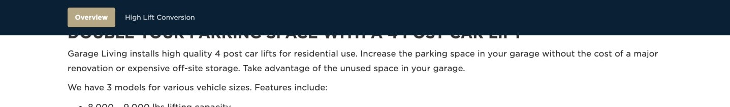
Source: Garage Living
These remain visible even as you scroll down a page. Unlike pop-ups, they typically do not interrupt your reading experience, but are there whenever you might feel like clicking.
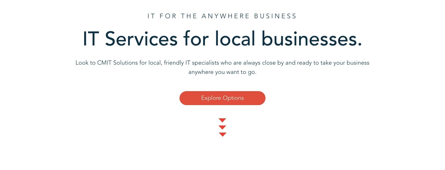
Banner/heading style CTA
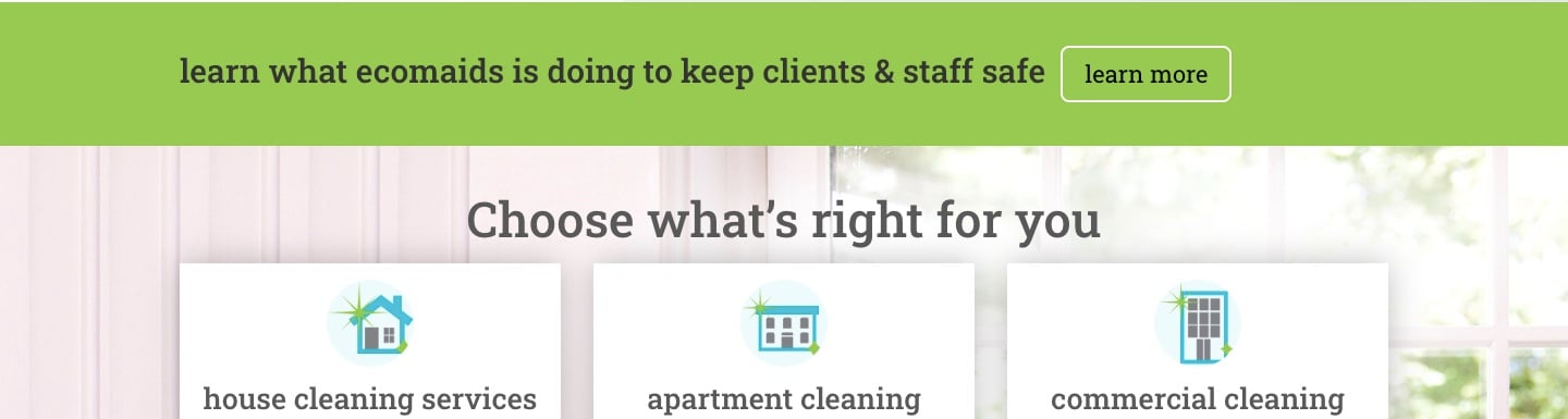
Source: Eco Maids
These appear across an entire webpage, often at the top of the site.
Form CTA
Source: Enviro-Master Services
These CTAs direct visitors to fill out an embedded form rather than a linking to another page.
Smart CTAs
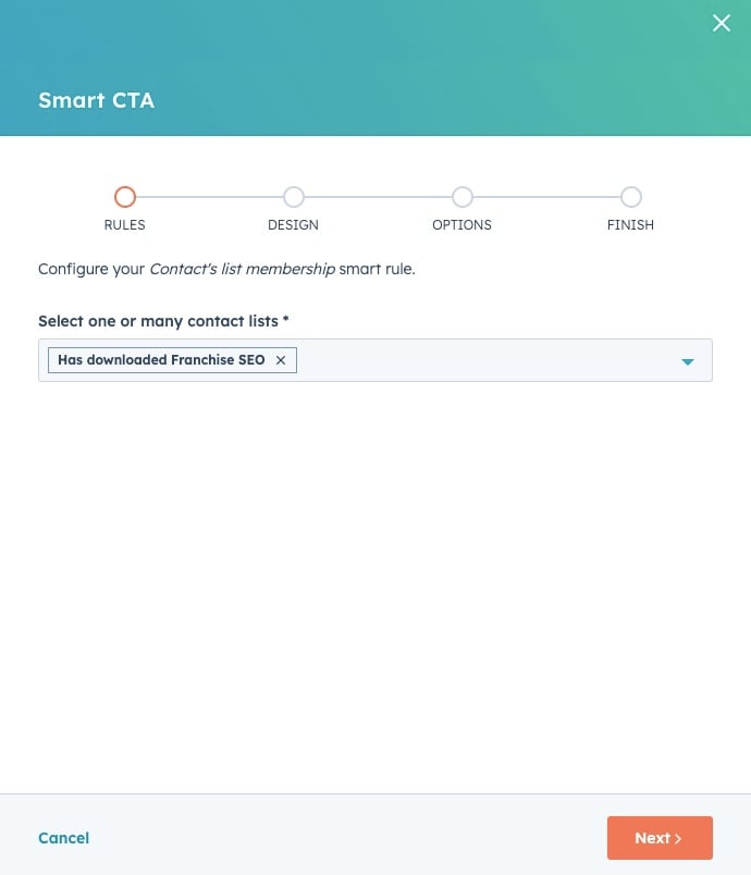
Smart CTAs display different offers depending on the contact viewing it. For example, HubSpot CTAs allow you to personalize CTAs to a user based on the device they're using or what pages they've viewed previously.
They've been demonstrated to perform better than regular CTAs.
Common CTA offers
While franchise CTAs entice with countless offers, some common types include:
- Read more (read more of a piece of content)
- Demo request
- Social sharing buttons
- Contact us
- Event registration
- Related content (check out content suggestions)
- Quiz
- Free trial
What makes a CTA irresistible?
While they may seem simple enough, marketers have been studying, testing, and refining calls-to-action for years.
While some of the research dives into deeper psychological findings like the effectiveness of using the word “Get” as opposed to “Download” on the CTA button itself, the fundamental best practices of CTAs are straightforward:
Enticing
Include language that compels interested parties to click in both your lead text (which precedes the CTA), and CTA itself. This is all about understanding your audience's motivations.
Reference your franchise buyer personas. Think about the value your offer provides in relation to the problem your audience is trying to solve, the emotions they're feeling, and their desires.
How does your offer help them:
- Move toward solving their problem?
- Soothe a negative emotion?
- Provide value they can't find elsewhere?
Example: Junkluggers
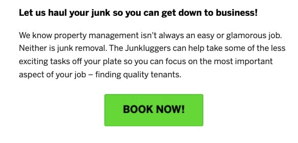
Source: Junkluggers
The lead text to this CTA strikes at the heart of property manager's frustration with junk: the hassle and attention diverted from more important tasks.
This copy is enticing because Junkluggers acknowledges the problem and positions themselves as the solution.
Brief
Less is more—don’t write more than a sentence. HotJar recommends just 3 - 5 words.
Why? You need to communicate your message clearly, directly, and quickly to ensure skimmers receive it.
Example: Fitness Machine Technicians

Source: Fitness Machine Technicians
Action oriented
In just about every case, your CTA should start with a verb to help persuade your audience to take action.
Example: Square Cow Moovers
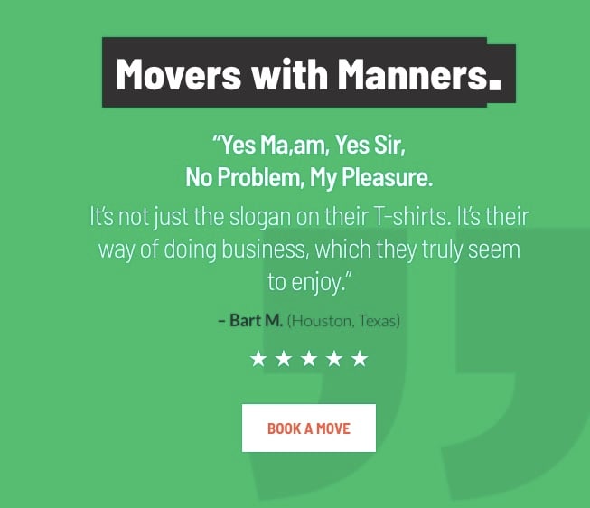
Source: Square Cow Moovers
Visible
CTAs need to stand out from the rest of the page so they aren't missed. This usually means:
- Use a contrasting color that adheres to your brand and fits within the surrounding design
- Use white space in your design to differentiate website elements, including CTAs
- Use a font size that's easy for everyone to read "12-16pt on a mobile screen, 15-19pt on a tablet, and 16-20pt on a desktop computer screen" (Toptal)
- Make the CTA large enough that it's easy to click regardless of screen size
- Position it where people are likely to be ready to click on it; often the top, bottom, or middle of a page, or after an explanation that could have left them wanting to learn more about an offer
Example: Hommati.com

Source: Hommati.com
This real estate industry franchise provides a CTA on its homepage that is impossible to miss. While it fits within the page's overall design and company branding, the generous (but not overwhelming) size of the box, white text, and brightly colored "search" button stick out from the background. It's also "above the fold" on the page, meaning there is no need to scroll to see it.
Clear
Be sure to state exactly what the visitor’s getting after they click. For example:
- A free case study with no strings attached?
- A 25% discount on their first quote?
- A free consultation?
Example: Office Evolution
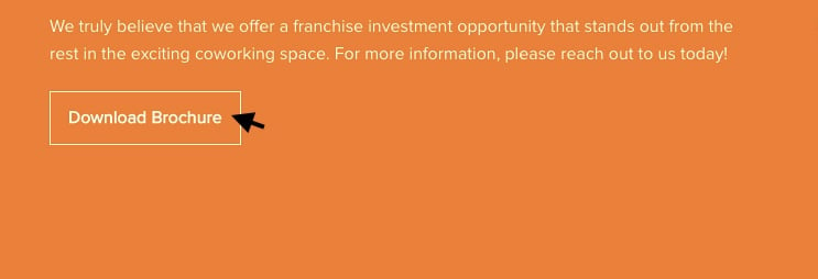
Source: Office Evolution
Short and sweet, this CTA telegraphs that clicking this button will lead to an opportunity to download the advertised brochure, as opposed to "read brochure" which would suggest an offer posted directly on the site.
Tailored
Compelling CTAs are written with their target audience specifically in mind, and the content of the page they appear on.
For example, a CTA like "learn more about our franchise opportunities" would not be very effective on a service page designed for franchise customers.
This above CTA is geared toward high-funnel prospective franchisees, so not only is it a mismatch in terms of audience, but also for funnel stage, since those visiting a service page are more likely to be mid-funnel.
A CTA like "get your free quote", on the other hand, would be appropriate. It's designed for franchise customers who are lower funnel, matching the page better on both counts.
Example: Culver's
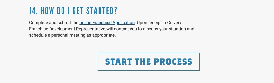
Source: Culver's
This CTA to start the franchise location application process appears at the bottom of an FAQ page especially for prospective franchise owners.
This is especially appropriate because not only is it tailored to the specific persona reading the page, but it's a lower-funnel offer. Ostensibly, those who read to the bottom are more likely to be interested in moving forward with an application.
Emotional
Communicating urgency or appealing to another emotion, like the desire to resolve a problem, can be an effective way to compel visitors to convert.
Example: Pirtek USA
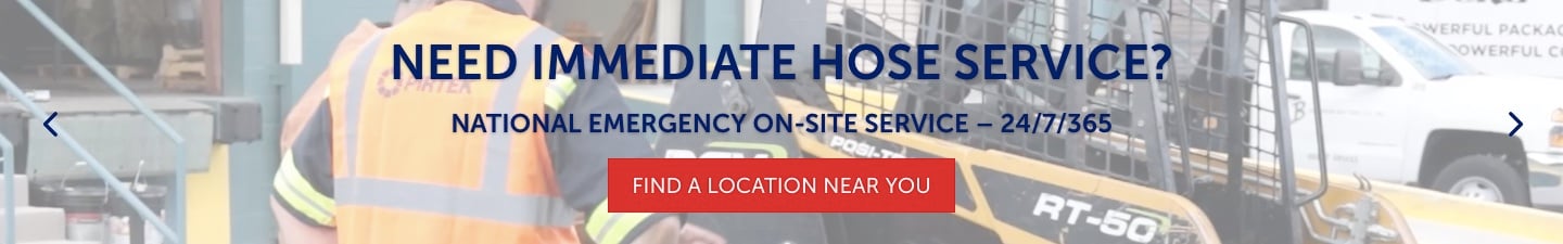
Source: Pirtek USA
This CTA acknowledges the urgent need (problem) that many of its visitors have, directing them to a location finder so they can fix the problem right away. Placing this on their homepage is particularly smart, since it addresses those visiting the site with the intent to purchase services soon.
What exactly is the next step of the conversion process?
After generating some interest while looking at your website, a prospect decides to download a white paper with some more information about your industry.
Where are they taken after clicking your CTA?
Answer: a landing page with a form they can fill to get the offer.
They receive their content, you receive their contact information, and a new lead is born. Forms can be customized to collect the kinds of data you use to segment your leads into categories.
Here's an example:
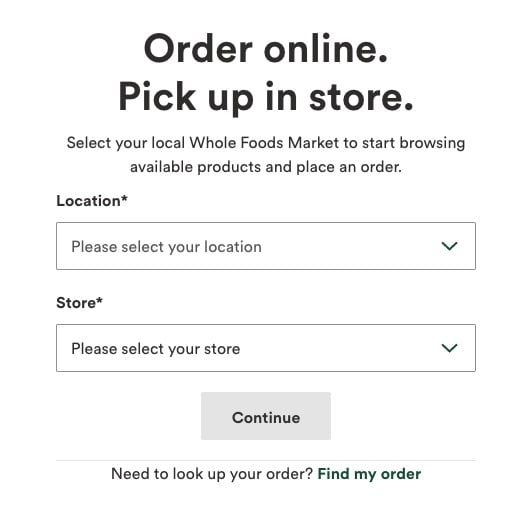
Source: Whole Foods
If you’re using an automated franchise marketing system, this lead is automatically added to your contact list.
Here, the lead and all of their submitted information is listed alongside the rest of your leads, which can then be reviewed to assess their level of qualification as a potential buyer.
From there, you can nurture the good leads by providing additional information and eliminate the unqualified leads.
Looking for more guidance on generating web leads?

Topics: Franchise Marketing, Website Optimization